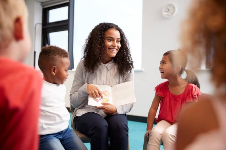
When it comes to creating the perfect children’s book layout, the details can make all the difference. From the type of font to the use of illustrations, the layout of a children’s book makes an enormous difference in how much readers will enjoy your book. If you’re a self-publishing author, it’s an important step to be knowledgeable about.
In this article, we’ll explore some of the key elements that go into designing the perfect children’s book layout, and I’ll share a children’s book template PDF with you, so you can create an engaging and effective experience for young readers.
What makes a good vs a bad layout?
Creating the perfect children’s book layout (also called formatting or book design) is a must for any self-publishing author or publisher looking to make an impression on young readers. A good book layout will help with the book’s flow and pacing and improve the reader’s experience. It can greatly enhance your story. And that is really the difference between a good and a bad layout–does it enhance the story, or make it less enjoyable?
There are numerous factors to consider, like how many pages you’ll have, how many words you’ll have on a page, if some pages will have only illustrations (no text), the typography, and the front and back matter.
A good layout should have:
- a clear and consistent font choice
- a balance between text and imagery
- easy-to-follow page layouts
- appropriate use of white space or neutral space
- a suitable size of the page for the target age group. Too small, and the book might be difficult for them to read and understand, and too large, and it could be impractical to carry around.
An overly complicated font choice, too much text and not enough imagery (depending on the age group) poorly organized page layouts, too much clutter, and an unsuitable page size for the target age group can all be detrimental to the overall success of a children’s book.
Your children’s book layout should be well thought out. From the font choice to the page layout to the size of the page, everything should be taken into consideration to ensure that the book is appealing to young readers.
Below are various aspects you need to consider for your children’s book layout.
Page turns for picture books
What is a page turn? It’s a way of getting the reader to (you guessed it!) turn the page and keep reading. Page turns can create suspense and anticipation for the reader, making the story more exciting and enjoyable.
Page turns in picture books are critical. They can help determine pacing and add humour, surprise or tension.
The best way to encourage page turns is to write a good story with a relatable character that creates tension and makes the reader want to continue reading. Page turns can be accomplished in many other ways, for instance, an incomplete sentence (or word) with an ellipsis, words like “then,” “until,” and “but,” or ending a spread on a question.
Illustrations also play a large part in page turns. Again, this can be accomplished in many ways. For instance, having half of an object on one page, but we can’t make out what it is. A moment of unresolved tension in the drawing, for instance, someone about to fall. A character peeking around a corner, making us curious about what they’re seeing. The examples are endless.
Here are two examples of good page turns in both the text and the illustration:
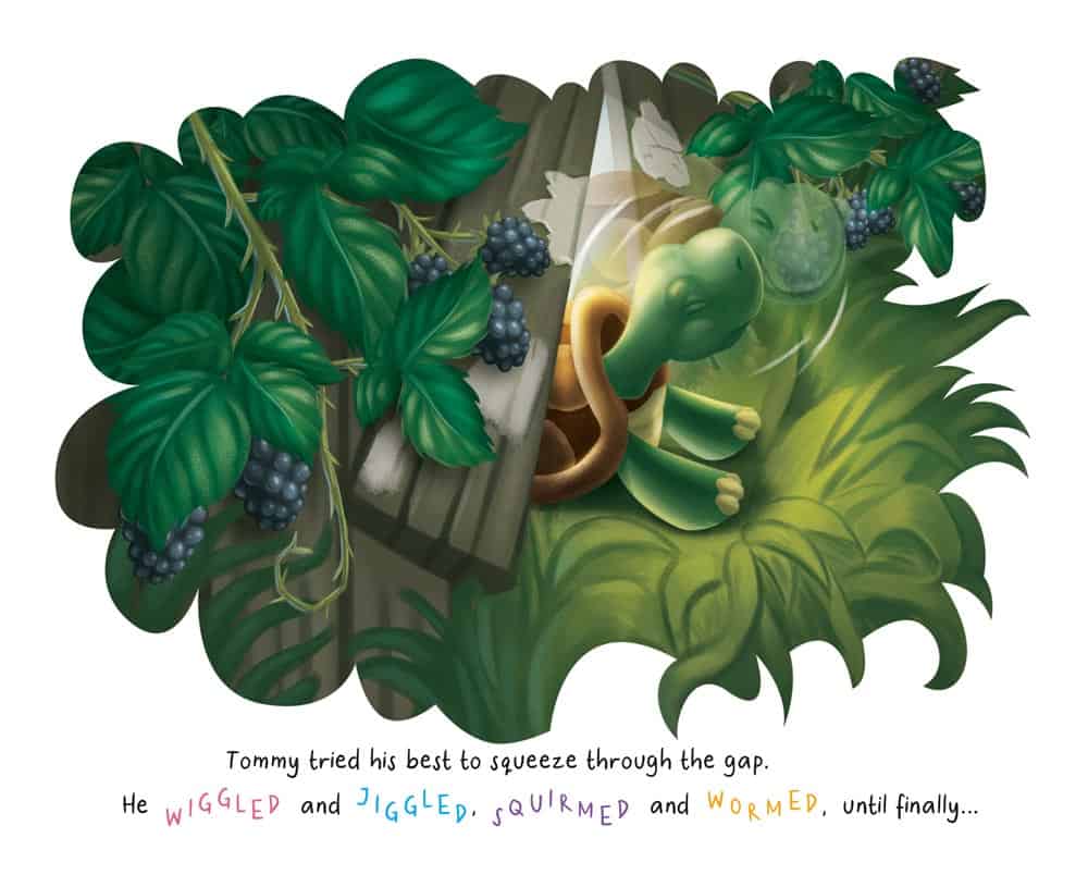
Illustration by GetYourBookIllustrations for Turtley in Love by Victoria Bailey
In this first example, the character is facing to the right, leading the reader’s eyes to the right (where they will turn the page). There is tension in the illustration, it’s unresolved, and the text ends on a cliffhanger. These all encourage the reader to turn the page.
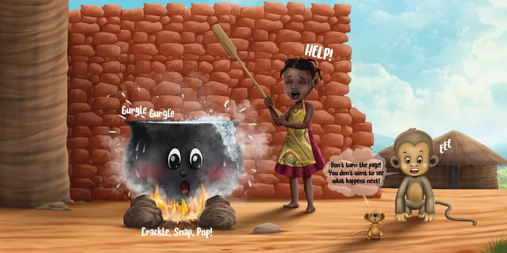
Illustration by GetYourBookIllustrations for Gurgle Gurgle Splat! by Coni Knepper
In this example, the pot is starting to boil over (the story has been building towards this). The girl yelling “Help!”, the monkey yelling, “Eee” and the mouse saying, “Don’t turn the page! You don’t want to see what happens next!” all entice the reader to turn the page.
Darcy Pattison shares some great ideas for page turns here.
If you’ll traditionally publish, the publisher will take care of all aspects of your book layout, including page turns. But if you plan on self-publishing, put care into planning great page turns as part of your book layout.
By carefully planning how page turns will be used, authors and illustrators can create the perfect children’s book layout that is sure to keep the reader’s attention. A storyboard is helpful for this. Read on, since I shared more on that a bit later, including a children’s book template PDF.
Have the right word count
An important consideration in creating your children’s book layout is the word count, which depends on the type of book and age group. For example, books for younger readers tend to have fewer words, whereas books for older readers may have longer words and sentences. It is important to find the right balance to ensure the book is engaging and understandable for the intended age group.
The word count also affects your page count, and for picture books and early readers, it affects your book layout too. If you have too many words they won’t fit, or you’ll have to squeeze them in somewhere on the illustrations.
The right word count for your age group and the type of book is essential. Parents won’t read a book that’s too long to their kids (or at least they won’t read it a second time), and children also can only digest books of the right length for their age.
Don’t ignore this. Know what your word count should be and stick to it. See a chart here under the heading “Have the right word count”.
Book Format
Will you have an ebook, printed paperback, hardcover book, or all three? You need to consider this from the start, especially the trim size you’ll be printing in.
Fully illustrated books have a fixed layout, meaning the text has a fixed position and size. This is necessary because, with text-only ebooks, the text can move around, but if the text moves around in a picture book, it will go out of sync with the illustrations. That means your ebook and printed book will have the same layout. If you have an ebook (which you should!), you need to ensure the text is large enough to read, even on a mobile phone.
Also, decide on the book’s orientation and sizing. Your book can be horizontal, vertical, or square.
The most common sizes for picture books are 8.5” x 8.5”, 10” x 8” (horizontal), 8” (or 7”) x 10” (vertical), or 8” x 8”. Under step #1 of this article there are some interesting ideas about which orientation may be best, depending on your story.
Create a Book Dummy or Storyboard
Book Dummy
A book dummy is very helpful when you are working on the layout of a picture book. It will also help you improve your manuscript. Use it to help you decide the flow of images, text and story, and to work out (at least roughly) how many illustrations you need. That will be helpful when you hire an illustrator.
Don’t worry about creating a perfect book dummy on your first try. The whole purpose is to keep experimenting with it until you feel you got it right, but your illustrator can also help you work out the final layout in terms of how many illustrations you’ll need.
Also, have a look at this Types of illustrations for children’s books article, specifically the section What are the types of illustrations for children’s books? This will help you understand the different types and sizes of illustrations you can use in your book.
Here’s how to create a book dummy:
1. Take about 8 blank sheets of paper and fold them in half, then staple them together in the middle. (1 sheet of paper will be 4 pages in your book. So you can divide your intended page count by four to work out how many blank sheets to staple together.)
2. Write your manuscript into the book dummy in pencil, dividing it up among the pages as you see fit.
3. Read through and move any text you think should be moved. Especially check for pages with too much text, or where there is not enough action or change.
4. Page through again and envision an illustration that complements the text. This won’t necessarily be what the illustrator will end up drawing, but you should be able to envision something, or else you need to rework your text.
This article (click to go to the article) has a clear explanation in the section “Picture books” with graphics to help you understand layouts better and where the front matter goes in a book.
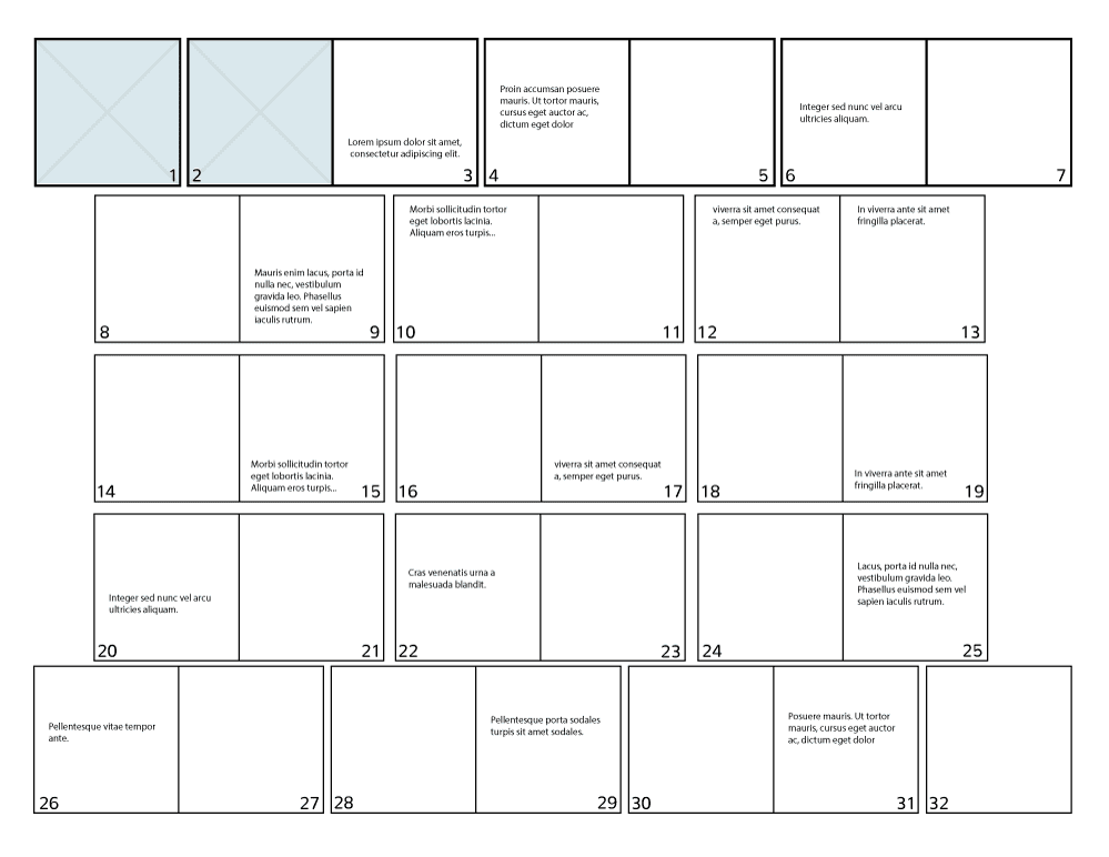
A storyboard
A storyboard allows authors to map out the page order and which text goes on each page clearly and concisely. Usually, illustrators create a storyboard where they draw thumbnail sketches of all the spreads on one big sheet of paper. As an author, you can create a storyboard that only contains your text and use it similarly to your book dummy. Of course, you can also do thumbnail sketches if you want to, but it isn’t necessary.
A storyboard allows you to see the entire book in one glance, rather than having to go through the entire manuscript page by page. You can use a storyboard to improve the story arc and adjust the pacing of the book.
There is a nice example of a drawn storyboard in this article about children’s book design.
Here is an example of a storyboard with only text. You can download a blank version of this children’s book template PDF by clicking here.
Book Illustrations: Hire an Illustrator or Agency
Creating the perfect children’s book layout really starts before you ever do the book layout. It’s essential to hire a professional illustrator who understands that the illustrations need to leave room for the text and that the illustrations should pull the reader forward through the book. It’s impossible to do a great job with the book layout if the illustrations aren’t done right.
Of course, illustrations are also important to help keep kids engaged and help to bring the story to life. The illustrations need to be in balance with the text, creating the perfect balance between visuals and words. Working with an experienced illustrator or agency will result in illustrations that are of professional quality, making the book unique and memorable. By investing in a professional illustrator or agency the illustrations in your children’s book will be of the highest quality and will help make your book stand out from the crowd.
As an author, you never need to work out what the illustrator will draw, but it’s helpful to work out some things for yourself before hiring an illustrator, like image sizing and which spreads will have which text. This would then help the illustrator know what to illustrate on each spread. Your illustrator can also help you divide up your text and work out how to lay out the illustrations.
This article will help you understand how to work this out: Types of illustrations for children’s books.
Here are GetYourBookIllustrations we’re always happy to help our authors work out the best way to divide their text so that they end up with great pacing and the most engaging illustrations.
Font and text size
When formatting a book for children, it’s important to consider their age group and reading level. Fonts should be large enough to be easily read, preferably 16-point or larger. For picture books especially, larger text is really important so that it can easily be read on mobile phones too (because the text size can’t be adjusted in picture book ebooks). For picture books and early readers, there is usually not a lot of text per page. For books for older kids, the text should have enough white space in between to make it easier for children to follow.
Simple fonts are always best. You can choose something fun or cute, but keep it plain enough so it’s easy to read.
Font choice for young readers is very important. While script fonts may look nice and decorative, it can be difficult for young readers to follow the text. For this reason, use a simple serif or sans-serif font. These fonts are easy to read, and the letters are distinct enough that young readers won’t have trouble deciphering the words.
Also, ensure your font matches the tone of your book and your illustrations’ style. If it’s a fun book, you can choose a more fun font. For a serious, sentimental book, choose a more subtle or reserved font.
Varying the font, size, and weight of text can help to draw attention to particular elements within a page. Avoid ornate or script fonts, as they can be difficult to read. Having your text in all capital letters should also be avoided, as it’s harder for children to read. Using bold or italicized text for headings and subheadings can help to break up the text and give readers an easy way to locate specific information. By taking these tips into account, you can create an engaging and easy-to-read children’s book layout that will capture the interest of young readers.
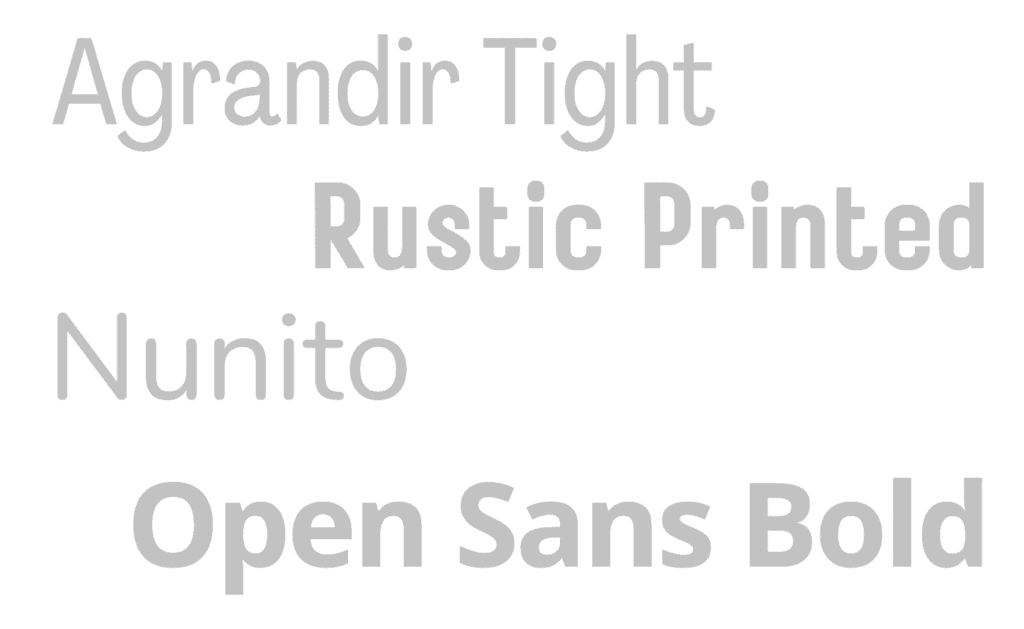
Serif, sans serif and script fonts
Serif
Serif fonts are typefaces that feature small lines or “feet” at the end of each stroke of a letter, making them more ornamental and decorative than other typefaces. Commonly used serif fonts for children’s books include Times New Roman, Georgia, Palatino, and Garamond.
Examples of serif fonts:

Sans Serif Fonts
Sans serif fonts are typefaces that do not feature small lines or “feet” at the end of each stroke of a letter, making them more contemporary than other typefaces. Commonly used sans serif fonts for children’s books include Arial, Helvetica, Futura, and Gotham.
Examples of sans serif fonts:
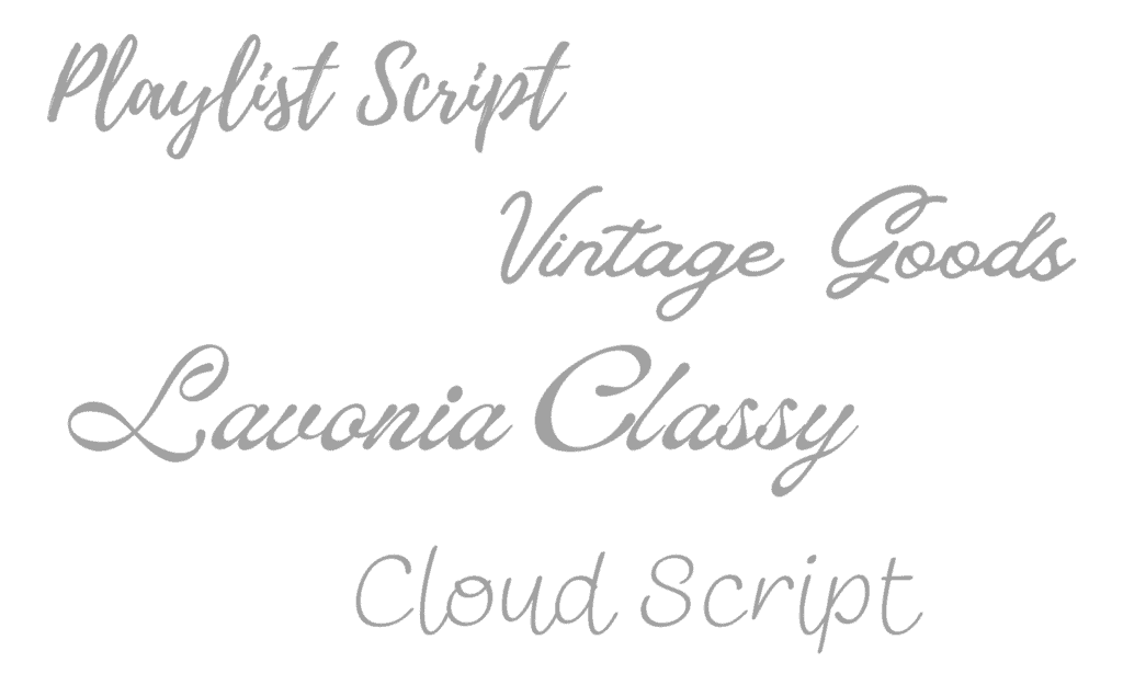
Script Fonts
Script fonts are typefaces that feature ornamental or cursive-style lettering. These typefaces are often used to convey a sense of elegance or sophistication. Commonly used script fonts for children’s books include Lobster, Pacifico, Great Vibes, and Playlist. BUT use them sparingly! For instance, you can use them in the title or to highlight a few words in your text. Never use these for long parts of you text.
Examples of script fonts:
By taking the time to choose the right fonts for your children’s book layout, you can create a design that is both eye-catching and easy to read. The right font selection can make all the difference in creating the perfect children’s book layout.
Placement of words
The placement of your words, and possibly illustrations, will depend on the type of book you are creating. As a very general division, there are books with text on the illustrations, and books with the text and images separate. These two approaches can also be mixed within one book.
Book layouts vary, for example:
- In a board book, the text is usually printed directly on or in between the illustrations.
- In a picture book, the text is usually placed on the illustrations, or it can be placed on blank pages next to the illustrations, or above or below the illustrations.
- In early readers, the text is usually on or in between the illustrations.
- In a chapter book, the text is often placed on facing pages with illustrations breaking up the text.
- In a middle grade and YA novel, the text is usually the same as in an adult novel, with little to no illustrations.
No matter the type of book, it’s crucial that the text is easy to read. This means if the words are placed on illustrations, they should be placed in neutral space with enough contrast between the text and the background, so it’s easy to read. Placing black text on a dark background makes for a frustrating reading experience. If text is between illustrations, there should be enough white space and space between lines of text.
For easy readers, the lines of text are usually short, so it’s easy for beginning readers to follow. Big blocks of text will overwhelm these new little readers.
For chapter books, chapters shouldn’t be too long. For some books, especially nonfiction, one can use headings and subheadings to break up the text and make it easier to navigate. This will help the reader to find the information they need quickly and understand the information being conveyed. Plus, it will make the book visually appealing to both children and adults.
The layout and placement of words in a children’s book is an important factor in creating a successful book. It is important to consider the type of book to decide which layout and word placement will be best.
Front matter and back matter
Part of your book layout will be to include front matter and possibly back matter. The front matter is the introductory material that introduces the book and provides important information such as the title, author, publisher, copyright date, and ISBN. It can also include a table of contents, which helps readers quickly find the sections they are looking for, as well as a dedication, acknowledgements, and preface.
Back matter is the additional material that is often included at the end of a book. This can include resources, activities, and websites related to the book, as well as a glossary of terms used in the book.
By designing your book with the right front matter and back matter, you can ensure that it provides readers with the necessary information, and you can use it to your advantage, for instance, by sending readers to your website or asking for reviews. So give some thought not only to the story but also to which sections you want to include as front- and back matter.
Book design (sometimes called formatting)
While it’s often called formatting for children’s books, especially books with a lot of pictures, it’s usually called book design. With formatting, there is not much design in terms of text and images. It will usually be a simple text layout only. For books with images and possibly more designerly text, like using different colours for the text, it’s called book design.
Here is an example of book design:
Illustration by GetYourBookIllustrations for Embaby Elio by Christina Oberon.
Hiring a book designer with experience in creating attractive and captivating layouts for children’s books is important. A professional book designer will understand the nuances of designing for different age groups and will take all of these factors into account when creating the layout for your book. They will also be able to help you pick the most appropriate fonts, colours, and images for your book. With the right book designer, you can create a beautiful, captivating and age-appropriate layout for your children’s book.
When searching for a book designer, there are a few important things to consider. You’ll want to make sure they have experience with children’s books and that they are familiar with the formats and standards that the industry requires. Look for book designers that have a portfolio of work you can browse through to get an idea of their style and capabilities.
It is also important to note that an illustrator who produces artwork for a book may not be able to do the layout as well as a book designer. Illustration and book design or formatting are two different skill sets. A book designer will have the expertise to ensure the layout is done properly and to create a visually appealing, professional-looking book.
For book design, there are several free options available, like Word Doc layouts or Adobe InDesign layouts. Some websites also offer free templates for book layouts, such as Canva. However, it is important to consider hiring a professional if you want to create a highly polished, professional-looking layout.
A good book designer can help you create the perfect children’s book layout that will capture the attention of young readers and keep them engaged. We offer professional book design here at GetYourBookIllustrations, so feel free to chat with us.
The next steps
Creating the perfect children’s book layout is an important step in writing and publishing a book. It is essential to ensure that the illustrations, text, and layout are all of the highest quality and that the book is easy to read and understand.
Once you have had your book designed, it is time to publish. Before publishing the book, it is important to do a final proofread and edit any text, images, or layout as needed.
Choose which platform(s) you’ll publish on. KDP and IngramSpark are good for new authors, as they do print-on-demand. This means that instead of printing many copies of your book, only one copy gets printed each time someone orders one. Be sure to always select their premium print options for fully illustrated books!
This will give you a chance to get your feet wet and learn the ropes of marketing. I suggest always starting marketing early on, really as soon as you start writing.
Once you are more confident in your marketing skills, for picture book authors, I recommend bulk printing with IAPC Books. Print-on-demand gives picture book authors a tiny profit margin, whereas bulk printing allows for a much bigger profit margin, and the printing is much higher quality.
Closing
Creating the perfect children’s book layout is essential for a book to be successful. It is important to create a layout that helps the story flow in a way that is appropriate for the target audience. The cover design should be eye-catching and inviting to draw the attention of potential buyers. And of course, high-quality illustrations can help enhance the story and make it more memorable for children.
These things take time and effort to make sure the story and visuals are engaging and appropriate for the target audience. So be sure to work with professionals, so you can have the best book possible!
I’d love to hear from you in the comments!
- What is your biggest takeaway from this article?
- Do you have a question about creating the perfect children’s book layout that I didn’t answer?
FREE Webinar: How To Write A Picture Book Without Self-Doubt Or Procrastination, Even If You’ve Always Struggled To Turn Your Idea Into A Story.